Result of my WAVE Report

Before receiving the WAVE report, I didn’t know what to expect, but I knew I had designed my blog to be visually pleasing. However, upon receiving my WAVE accessibility report, I discovered 12 contrast errors. Upon closer inspection, it became clear why. I had used light-colored text on a light-colored background, reducing visibility and making navigation difficult for some users.
Moving forward, I will aim to make design choices with the awareness that users come from diverse backgrounds, cultures, and may have special needs. The WAVE report brought this realization to light. I will be more mindful of colour choices, ensuring adequate contrast. I will also consistently add alt text to describe images for those who cannot see them. When posting a video, I should add captions or subtitles for people with hearing challenges. It also improve the viewing experience for users who are watching without sound or in languages other than their native language.
Text to Speech Tools
There was a class I took previously that required us to read articles or academic papers. Whenever I encountered an academic paper, I felt overwhelmed and intimidated. As I began reading, I would quickly lose interest and give up midway. I thought that perhaps if someone read it aloud to me, I wouldn’t feel as burdened. So, I decided to try using text-to-speech tools. In my experience, this method proved much more effective than reading on my own. Hearing the words being read aloud entertained me and helped me complete the reading without feeling intimidated. One interesting observation I made is that if the narrator sounds too robotic, it’s difficult for me to concentrate and comprehend the information. When the narration is too mechanical, I find myself tuning out as I don’t retain any information. In such cases, I find it preferable to read the material myself rather than have a robotic narrator read it to me.
My Canva Experience
It was my first time actually using Canva. As I explored Canva, I discovered it has a lot of templates, such as resumes and posters, which are really useful, especially for someone who isn’t too talented with graphic design. Everything you might need is already made, and you just need to make a few adjustments to fit your vision.
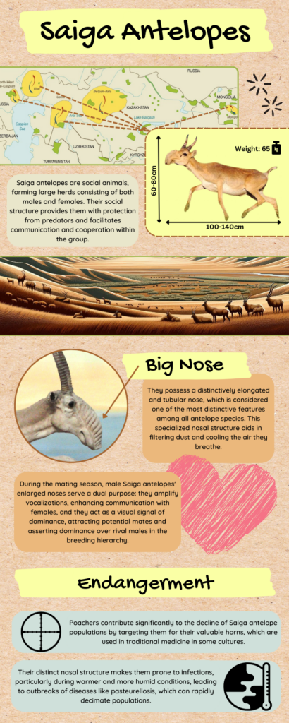
When I created my infographic, I first focused on alignment and hierarchy. I didn’t want the information to be displayed in different directions, as it would be hard for readers to follow. So, I decided to have the information flow from top to bottom. The title, sub-heading, and body text each follow the same font and text box designs. I optimized the colors so that each text box is color-coded to delineate distinct sections.
I kept my infographic short and sweet. I could have added more information, but I made sure to include enough to introduce my topic. Having a short infographic encourages readers to engage with the content, and my goal is to not overwhelm them with essay-like length. I added graphics to represent information, so that readers can comprehend the topic at a glance. I tried my best to structure it well, designing it so that readers would follow it from top to bottom. The colors follow a palette, and all text boxes have the same design. I wanted my infographic to evoke a sense of the environment, since my topic is about an animal whose habitat is in a dry land, so I chose colors that represent that. I aimed to educate people about this particular animal, so I did my best to introduce and provide interesting facts about them. I was aiming for a visually appealing design, but I’m not really good at graphic design, and my resources on Canva weren’t enough to achieve my goal. However, I think I was able to get my message across by following the design principles and incorporating the elements of a ‘good infographic’.
Overall, it was really fun to make this infographic. Here is my infographic about the animal called Saiga Antelope. I hope you find the content interesting.

Hey Maika!
I had a very similar problem when using text-to-speech tools. I found that some AI online transcriptions have had much better pronunciations! Way less robotic! I forgot which one I used but I will let you know when I find out!
I really loved your info graphic! The flow was great and colours worked very well!
Hi Maika!
Really love your infographic! I like how easy it was to navigate with labels close to the diagrams. The high contrast in the text was also really accessible for those with vision issues. I also found that I had contrast errors on my blog as well which is interesting because the teal that you chose looks quite high contrast to me! Makes me wonder how dark the colour has to be.